Big iPhone Options
We all know iPhone is the most popular US smartphone, but is that because it's smaller or despite being smaller? For that matter, if Apple fielded a larger iPhone, how would they do it?
Apple has faced this question before, so let's look at the past solutions.
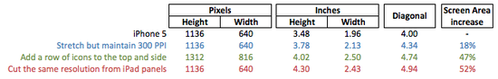
For iPhone 5, Apple added 1 row of icons to the top of the iPhone 4S screen. This made it 4.0" diagonally and increased the screen real estate 18% from the iPhone 4. Also, this made the screen's aspect ratio 16:9 which is the common aspect ratio for video. Thus, they optimized for their supply chain by keeping the same screens they were already making, just cutting them slightly bigger. They optimized for users, giving them a larger screen and better ratio for video viewing. And they only sacrificed slightly for developers, since the screen dimensions only changed in one direction (height).
For iPad Mini, Apple used the same iPhone 3GS panel, but cut it into bigger pieces. Apple manufactures these screens in large sheets that are then cut to size. So instead of cutting them into 3.5" screens, they just cut 7.9" screens. For Apple's supply chain management this was a genius solution - they were already making that screen panel for 3 years. And developers didn't have to change anything, all their iPad apps were already made for the big iPad's 1024x768 screens. Everybody won - Apple didn't have to create a new screen, developers didn't have to create new apps, and consumers got an iPad Mini.
As I've just alluded to, when creating a new device Apple balances 3 main forces - supply chain, developers, and users. For supply chain, Apple's best case scenario is using screens that are already being manufactured. For developers, the best scenario is a screen resolution that their apps are already made for, and users want the best screen clarity at the most optimal screen size (not necessarily the biggest).
With that background, let's walk through some options for a bigger iPhone, and how they would each balance those 3 forces.
;)
4.34" screen: Stretch the screen, but maintain Retina >300 ppi
For a screen to be deemed "Retina" it must be at least 300 pixels per inch (ppi) (at the same viewing distance of the iPhone 5). The current iPhone 5 is 3.5" tall and 1.96" wide and 326 ppi, so Apple could stretch the screen to exactly 300 ppi and still call it Retina. That screen would be 3.78" x 2.13", with a diagonal distance 4.34" and having 18% more screen area than iPhone 5. Since the pixels would be a new size, this would require entirely new screen manufacturing by Apple, but only provide minimal screen size increase to users. Developers would have to make no changes. So developers would be the clear and only winners in this scenario, with Apple and users making significant compromises. For such a small increase in size, and such large sacrifices, this option isn't likely.
4.74" screen: Add a row of icons to the top and side
Applying the same idea used in the iPhone 5 (adding a row of icons to the top), Apple could make a big screen iPhone by adding another row to the top and one to the side. Doing this would yield a 1312x816 pixel screen, with actual dimensions of 4.0" x 2.5". Conveniently, both very round numbers - so we may be on to something. The screen diagonal calculates to 4.74", which is a 47% increase in screen real estate from the iPhone 5. So users would get almost 1.5x the screen area, and supply chain could utilize current panel production - both of those are great - but developers would pay the price. Developers would have to reformat both dimensions of their apps. While this is an okay solution, it only makes sense if Apple is prepared to indirectly tell developers their experience is less important than user's experience.
4.94" screen: Cut iPhone 5 resolution screens from iPad panels
Applying the same idea used in the iPad Mini (using screens already being made), Apple could cut iPhone screens from iPad panels. Cutting the iPad panels to 1136 x 640 (the iPhone 5 screen resolution) it would be 4.3" tall and 2.43" wide. Unlike the previous options, this screen would be the same 264 ppi as the iPad - which only qualifies for Retina at 15" viewing distance. The diagonal would be 4.94" which is 52% more screen area than iPhone 5's 4.0" diagonal screen. Supply chain would not have to manufacture a new screen density, developers would not have to reformat any apps, and users would get an iPhone with 1.5x the screen area. There are no big sacrifices in this scenario.
This gives Apple 3 options, spread across the size range from 4" to 5".
The best option is the one that balances the 3 forces. But balancing isn't purely making the least possible sacrifices, it's also making the worst sacrifice the least impactful. For iPhone 5, developers had to make small adjustments while users and supply chain benefited. For iPad Mini, users got a non-Retina screen to benefit ease of development and supply chain (which will be null when iPad Mini gets upgraded to Retina screen).
In order to build a bigger iPhone, the best balance is to cut 4.94" screens from iPad panels. Developers don't have to alter their apps, Apple's supply chain maintains its beautiful efficiency, and users get a new iPhone option that is 1.5x bigger. The worst sacrifice would be users get a screen that's 36 ppi shy of Retina.
 Mar 28, 2013 | Permalink